I love traveling so I am always looking for the best deals. Usually the app I use is “skyscanner” but sometimes the deals are not as cheap as I wish, that’s why I am always on the hunt of new flight websites. Sometimes I have that very unique feeling that travelers have. the one that makes you run to the first device you find to check some flights with hope and expectation. You look for weekend flights or crazy vacations .It doesn’t matter. what it matters is that the idea of this makes you happy.
That’s how one day reading a travelling blog I found Wow air. It was very recommendable and there was only good words for it so I decided to give it a try. I download it on my phone and my first impression was good. the homepage is clear so I thought I had finally found a good App. Unfortunately when I tried to check the flight prices everything went down.
I couldn’t find the flights or offers as quick as I would if I used some other app and this discouraged me,still,I continued the booking process but everything was quite confusing so eventually I gave up. I believe half of the people who use this app are just checking the flight prices without really planning to buy them just yet. It’s just a first contact with the idea that might success eventually if you find an offer that you can’t resist. But at first you just wanna know how much and when.
That’s why I believe that the most important features on the page should be those ones: how much and when.
THE COMPETITORS
First of all I took a look to some of my competitors to see what kind of lay outs the have, what icons they use and what´s the general feeling of their Apps
Skyscanner
Their design is the more minimalistic of all, using icons instead of words for search and to choose the number of people.This still works because this icons are very well known so there is no confusion (here we see a good example of signifiers!).The travel class is a dropdown menu which saves space on the page.The option for one way or round trip is situated at the top with a tab style.It also places the origin and the destination one on top of each other accompanied by the flight icons.This makes it easy for the user to know what the space is for with only one glance.
CheapFlights
This app places the origin and destination one besides each other followed by a two buttons for the round trip or one way features. There is no confusion on the functionality.
Something I notice is that the app sends a few notifications every day.This could be useful for some users but it could also backfire and make the user uninstall the app.
Kayak
Kayak´s from page is also very minimalistic. They use lines instead of boxes for all the input fields. Even though it works I personally don’t find it as clear as other designs since I believe it’s important to understand the page with one glance and this doesn’t happen so quickly here.
Fly Delta
This app offers two options that aren’t that common. First of all it allows you to choose a multicity trip. Even Though is not an essential feature some users will find it useful and will choose this App only because of it.
The other feature that I also didn’t see very often is the option of showing the price in money or miles. Business travelers will find this feature really useful.
As for the rest it shows the passengers as a drop down menu and the search button is big and has a different color, which is consistent with the other fight apps that I’ve been looking at.
Flights
This app focus its attention in the origin and destination, placing them at the top of the screen, while the number of passengers and the travel class is placed at the bottom.The number of passengers is represented only by an icon. This app also places the options of single way, round trip and multycity as a tab on the top. It also uses the plane icons for the arrival and destination section.
MY CONCLUSIONS
It seems that using certain icons to represent some of the features works well and doesn’t cause any problems due to the general knowledge of them at this point. This is why I think the new Wow air app should also use icons for the number of passenger as well as accompany the arrival and destination areas with the plane symbol.
I also believe that this two sections should be the center of attention. In the current App there is not enough space designated for it and this causes that you can’t read the full name of the cities. It only shows the short name of the airport and the beginning of the full name. I think this isn’t clear enough so I would like to place this two sections one on top of the other, taking the full width of the page.
Another thing that I’ve notice my competitors do very often is display the travel class (economy, business or first class) as a drop down menu. I believe this would be a good option for wow air as well. the majority of the flights booked will be economy class so it will be shown by default and if the users prefer another option they will be able to chose it easily( this is only based on my assumptions, for more accurate information we would need information from wow air )
I also think you should be able to read everything clearly and this is why the input fields should have a white background and black text. I will keep the brand colors, purple(#90387b) and yellow(#ffed00) everywhere else except here.


THE USERS
To understand the needs of our users I’ve created three personas that represents them. each of them has a specific needs and the Wow air app should be able to satisfy them all.
THE NEW DESIGN
I decided to give more space to the origin and destination since it is the first thing the users want. I also decided to add the icons to make it more visual.


To choose the destination I’ve decided to use a drop down menu and to give the option to write the name of the place as well as choosing it scrolling through the list. I also decided to place the current location on the top. On the destination drop down menu the last search will be placed at the top of the list.


The screen to see the calendar has now a white background color which allows you to see the numbers clearly. “Depart” is marked in yellow so the user knows exactly where he/she is.


I decided to show the flights in a different way as well, with a little space between them and keeping the price always at the to throughout the whole process, so the users always know how much they will have to pay.


I also decided to change a bit the look of the passenger details, showing the price and the origin and destination at the top (as I said, this will be here throughout the whole process) I will also keep this lay out for all the other screens in which the user has to introduce some details to make it consistent.


The plane icons are from https://www.iconfinder.com
The round trip icon is from :http://www.flaticon.com/
THE USER TEST
To see if my design was good I conducted a user test and I recorded the test using the google chrome tool “Screencastify”.I asked some introductory questions as well as closing up questions.
Introductory questions
- Age range
- Gender
- Do you currently use a flight company webpage or app?
- Why did you choose them?
Closing up questions
- Is there something that you found confusing or that didn’t make sense to you?
- How easy was the booking process?
- Is there something else you would like to suggest?
This is the task the user was asked to do:
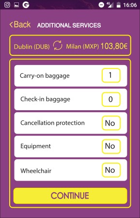
“Book a flight from Dublin to Milan from the 7th to the 11th of february. Choose the cheapest option and take sits 6A and 10F.”
You can see the Marvel App prototype here
As a result of the test I concluded that the new prototype for the Wow air app is good and clear for the users. I will change the screen “Additional services” make the options look like a button, since it seems that it isn’t clear enough.
This is the screen Ive changed after conducting the user test: